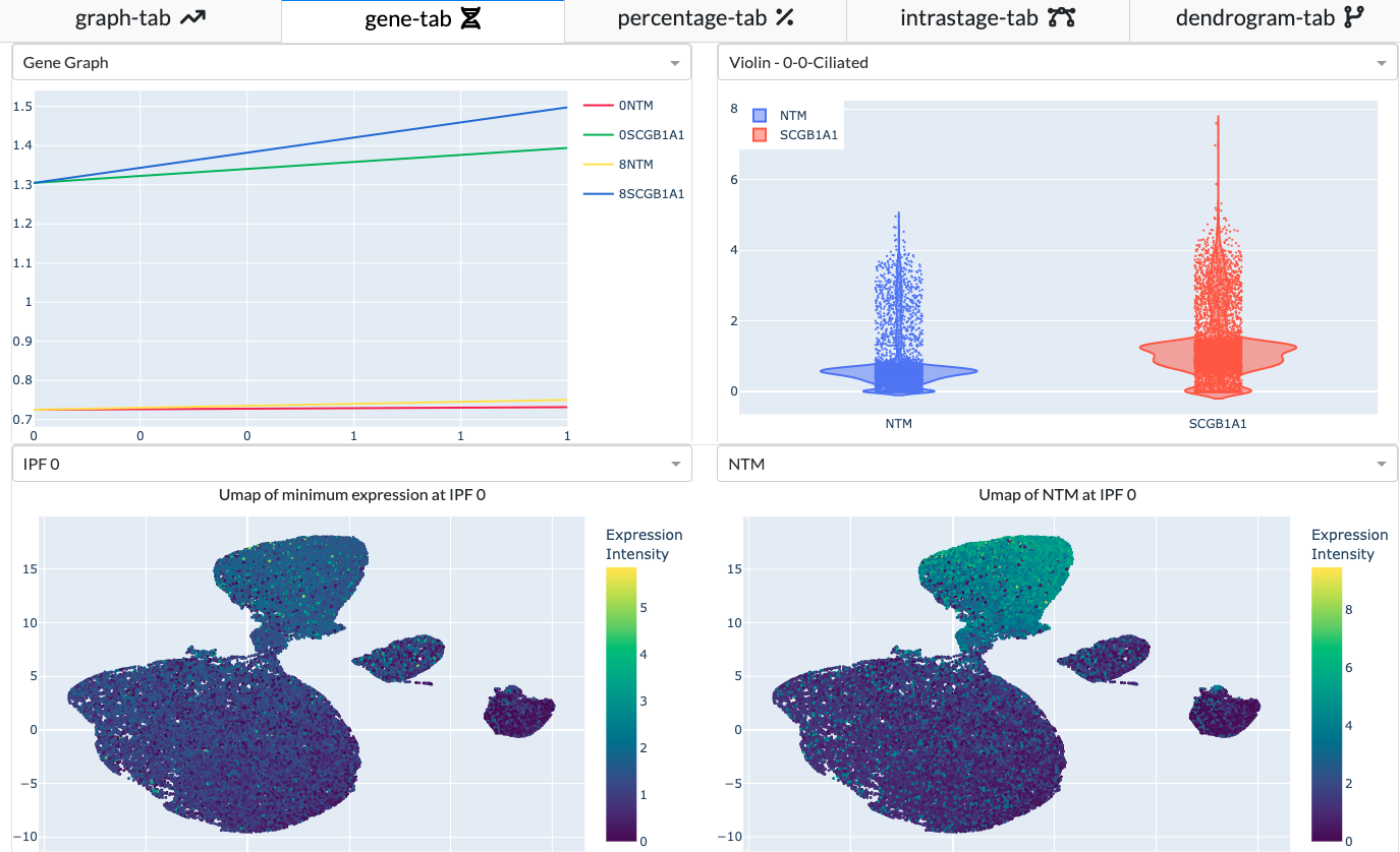
In Gene Tab, you can find the plots generated based on your cluster and gene selection. A tutorial on navigating the gene tab can be found here.
Heat Map
The heatmap will be drawn using scanpy. The y-axis will be the gene(s) you select and the x-axis is the gene expression of genes grouped by leiden.